


Fine Feathers Make Fine Birds.
And make them fly even higher!
Brands & Humans Are the Same
Before any stranger starts to hand out with you & get to know you better, they need to find you visually attractive just to come closer and say "Hi!" - unless you have a t-shirt with your virtues & values printed all over and huge chunk of faith that others believe it without a single question asked.
The Type of Face
Narrow, round, monospace or even blackletter - does it even matter? Aside from it's usability and accessibility - not really. The key is to research and select fonts that maintain flow of the entire brand & provide the best overall experience.
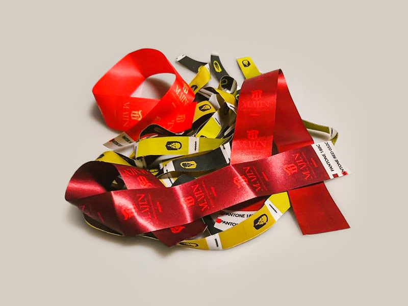
5✹ Shades of Grey
Some call it colour psychology, others just go with what they like at present moment. The truth? As always, in between. The reality? A sheet of white paper and chat that undermine biases while revealing the brands true colour.
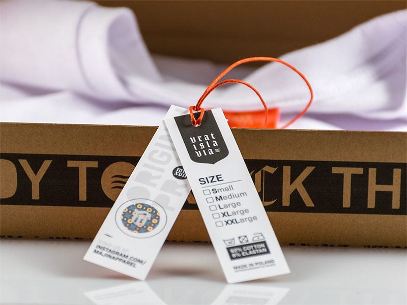
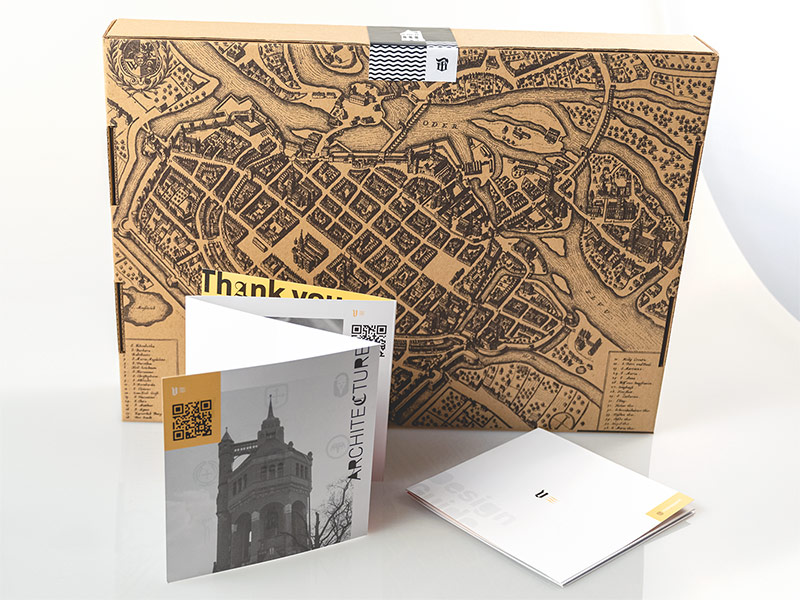
Dress to Impress
W stands for W✹W - and as it happens Welcome Pack as well! That's one of the first moments to really step up your business' PR/HR game and like with any other brand-centered touchpoints - the better it is, the bigger the chance of standing out from crowd & growing your company in numbers - all numbers, in and out.


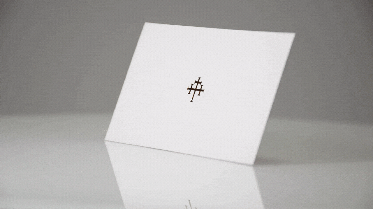
Classy Is Not Passé
You might not need a cassette recorder & pencil anymore but there are still couple of timeless accessories any professional should have by their side - business cards are one of them. Investing into more sophisticated designs & techniques makes a difference not only in your wallet but mostly your brands recognition - 9 out of 10 are the same, the last one is yours and it's the one remembered. In the end - isn't this the goal?

Don't know if or how any of this can help your busines, product, service stand out?

